
Another collaboration from street artists Blu and Ericailcane and again it is big, it is some awesomesess for your eyes.


Photos from Hypebeast
Another collaboration from street artists Blu and Ericailcane and again it is big, it is some awesomesess for your eyes.
Photos from Hypebeast
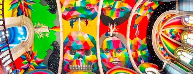
Digital Media, the new solo exhibition by Skullphone, aims to bring the playfulness, obsession, irony and anxiety of the Los Angeles-based artists’ renowned street installations into the Subliminal Projects space.
In Digital Media, Skullphone examines the contradictions inherent in outdoor digital signage, demonstrating cause for both wonder and concern over the increasingly ubiquitous medium. The artist explores advertising, government and private enterprise signage, and the California landscape on which outdoor media proliferate, making permanent on panels what is removable and reprogrammable in outdoor space.
Although of the same spirit as his past work, Digital MediaIthink marks a distinct visual departure for the artist. His use of mirror-polished, black-painted aluminum panels is a cold and slick leap from past works on found wood, weathered metal, and wheat-pasted paper. Skullphone’s painting technique employs a deliberate dot grid system, and his painted color is expanded to a limited palette of red, green and blue. This shift corresponds to the artist’s recent inspirations and exploits with outdoor digital media. Through painted pointillism, the imagery dislocates as the artwork is approached.
N.B: The words above have been taken from the website www.subliminalprojects.com
Watch below the preview of the show which is currently running until the 2nd July 2010 at the SUBLIMINAL PROJECTS GALLERY, Los Angeles, USA.
ART-PIE
To celebrate the release of Beats&Drips 2 boxset, Sofarida has invited Horfé to Celal gallery for their 1st solo show in France.
http://www.flickr.com/photos/chasingghosts/sets/72157626310867397/
The shows runs until tomorrow so hurry.
Also included, a teaser video of Horfé’s first solo exhibition in Paris, Celal gallery, jump
Music « Beaten thursdays » by Prefuse 73
Beats&Drips Part2 // HORFE : Passage
Where: Celal gallery
Opening: until 09.04.11
galeriecelal.com
sofarida.com
chasinghosts.com


A document filming and following the entire Burning Candy crew is being shot right now. Their Street Art is a familiar visual encounter on the walls of London and especially in East London and on Brick Lane.
This movie is still being shot but the preview material is now ready to be shown to lucky people. Indeed, only a couple of sessions for about 12 guests each time will take place at 7pm on Tuesday May 4th and Thursday May 6th at Black Rat Projects so to get the chance to assist RSVP yourself now at and hope to be one of the randomly selected. Continue reading Dots : a Burning Candy film
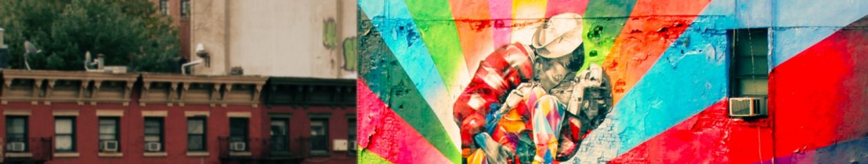
Artists Blu and Ericailcane joined forces in Bologna and have produced a rather mighty mural in Bologna, Italy. Ericailcane got in charge of the animals while Blu put up the cage and other elements.
BEFORE

AFTER


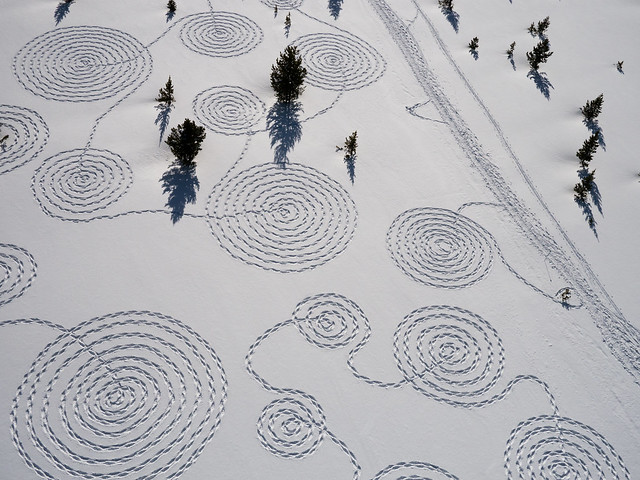
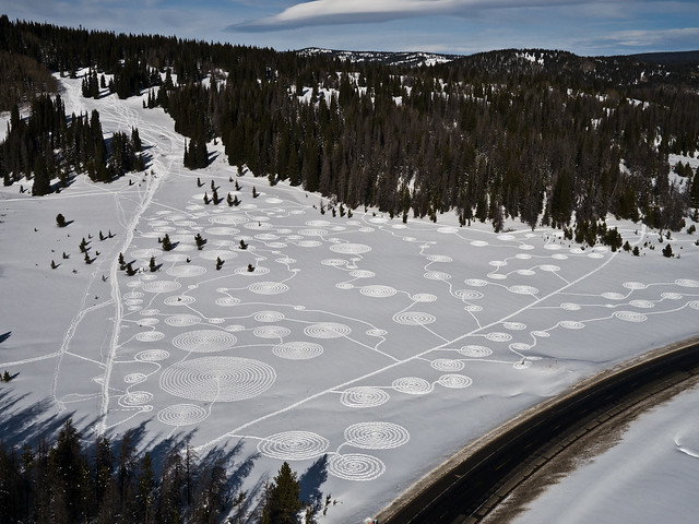
There are many ways of enjoying snow, some would get strapped on their snowboard and speed down the slopes whilst other may just look at it falling down. Sonja Hinrichsen thought otherwise, radically so even.
She gathered five people and warned them they will be needed for a few hours, 3 to be precise. To do what? Snow circles. Filmed from the air and the whole thing acquires another dimension, majestic and surreal. Video and pictures below.
> View another drawing from Sonja
> Full photoset for “snow circles”
Looks promising. Pic by @DownInAutumn

This year, Crunch: the art festival at hay will bring the same mix of thought-provoking debates, incisive talks and late-night parties. For one magical weekend in November, an eclectic set of artists, gallery directors, art critics, authors, academics, philosophers, film-makers and musicians will congregate in Hay to debate the big question: what’s the point of art? Continue reading Crunch 2010 – The Art Festival at Hay: book the date
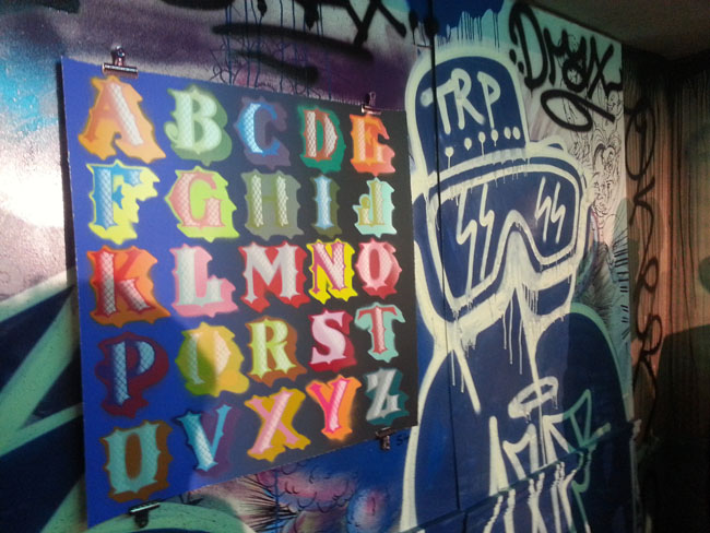
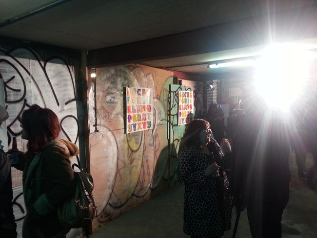
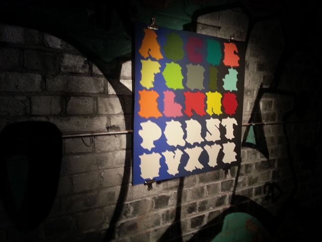
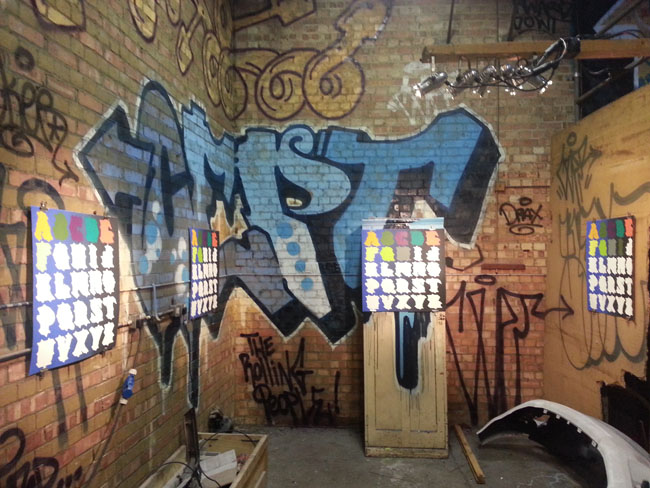
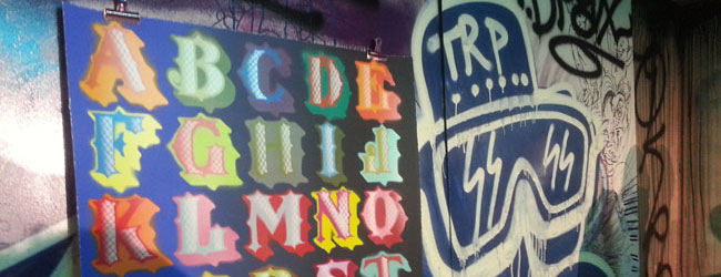
 When I first read about this event from my inbox, I must admit I got quite excited as Ben Eine and his work are exciting. If you love colours, letters and typography, you will appreciate this artist’s work.
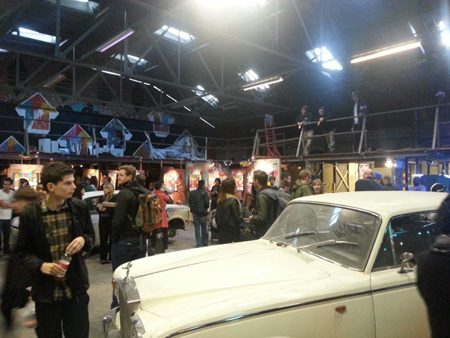
“The venue will be announced just before the show and via Nelly Duff’s social medias”. This was enough to convince me that we were on something good.
I was wrong. What the show had to offer was a series of pieces with the whole alphabet broken down in a multitude of versions, different colours, not coloured at all, this sort of things. It did not take me long to go round the whole venue to have seen it all. I actually must more enjoyed the old graffiti and tags spread all around the venue from old jams or other shows.
I have not mentioned the launch of of ‘The World Atlas of Street Art & Graffiti by Dr Rafael Schacter that happened that night too just because, let’s be honest, the hype around Ben Eine did a good job by bringing people in and to get the copies of the book flying off the shelf…
We took a few pics anyway.