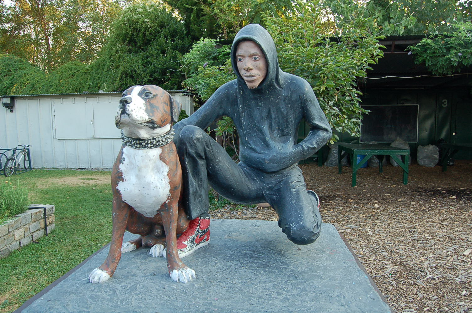
Acrylics on clothing explains by MWNYC www.mileswickham.com Continue reading Tutorial: Acrylics on clothing by MWNYC (video)
Acrylics on clothing explains by MWNYC www.mileswickham.com Continue reading Tutorial: Acrylics on clothing by MWNYC (video)
Hibernate is an amazing selection of works from some of Hang-Up‘s favourite urban and contemporary artists.
With brand new limited edition prints and original artworks from the likes of Mark Powell, Pure Evil, Delphine Lebourgeois and Joe Webb as well as sought after collectors pieces from Takashi Murakami, Banksy and Invader.
We included below some of the pieces from the show
WHAT – Hibernate
WHERE – 81 Stoke Newington Road, Stoke Newington, London N16 8AD
WHEN – until 31/12/2015

We met Fintan Scott-Magee originally from Brisbane and try to find out a bit more about his liking, it seems, for rubbish and bins in his art.
A-P: Tell us about yourself in a few words?
FINTAN MAGEE: My name is Fintan Magee, born in Brisbane Australia. I have been writing for 10 years now but I started to move away from traditional letterforms about 4 years ago and started to paint more canvas and street art. Really I’m just trying to have as much fun as possible with my art while I am still young and stupid enough not to know better.
A-P: What is your process/approach when making graffiti/streetart/art?
FM: I prefer to paint strait onto walls using oils, acrylic and of course spray paint. I like to paint in abandoned buildings a lot so I can relax and paint for as long as I want, the problem is my city is growing very quickly and becoming so developed that there is a shortage of empty and forgotten spaces. In my city almost everything painted on the streets is buffed within a week so I don’t really do many paste up’s or stickers any more, they say my city is clean but I just find it sterile.
A-P: Bin bags, rubbish seems to be an element that you like, why is this?
FM:The rubbish is just something thats developed over the last few months because I was painting still life images of things that have been forgotten or left behind on the streets, I guess I like to add depth to what may be considered bland or boring subject matter and not worth painting. I believe that we live in such a throw away and progressive society now that we overlook the beauty in many things that we consider expendable.
A-P: Where/what do you look for inspiration?
FM: I guess I look everywhere for inspiration, I think as an artist its important to take in the simple things around you, popular culture, nature, the city, your friends, etc. Keep looking and you will eventually find inspiration and influence where you least expect it.
A-P: Any upcoming shows/projects?
FM: I am travelling to Sydney and Melbourne in June for some group shows and to do some walls, I also have a Solo show at Jugglers gallery in Brisbane in August and another solo show in Melbourne’s Rtist gallery in November. After that I think another overseas trip is on the cards, possibly to the Americas. I have been back in Australia for two years now and I am starting to get pretty itchy feet.
Thank you to Fintan for taking time for this interview
Pictures below of some of Fintan’s works. More on this website: www.fintanmagee.com


I managed to get to see the current group show at Signal gallery and I am glad I did. The shows called Mixed doubles presents works from Dan Baldwin, John Squire, Andrew Mc Attee, Sean Madden and Joram Roukes.
While I am familiar with the first three artists mentioned, I did not know much about the two latter ones – Sean Madden and Joram Roukes and what a shame that is as these two have got very strong and powerful works on display.
Joram Roukes – oil on canvas
 Like Dan Baldwin, Joram Roukes does figurative paintings but unlike Baldwin’s works, Roukes’ color palette is lighter making the whole composition a lot less intense. But looking at what those paintings depict – series of layered figures, completely at random – you get for example what looks like a human body but with a bear’s head or a dog’s one, looks closer and you will notice the back stabbed with the back of an aircraft on fire; Joram Roukes’ paintings also have got an intensity in them.
You will have got it by now, Joram Roukes work will probably appear ridiculous to some but also and most probably like a joy for more people. Funny and intriguing could summarize what this is all about.


Sean Madden – bronze sculpture
I did not pay much attention to this artist when I first read about this show, I could blame on the gallery for actually not mentioning an awful lot about him but I should have made my own research so we call it a draw. We are looking here at sculptures work. Not a fan of these type of work, Sean Madden is certainly one of these artists that will make you like sculpture or at least take a closer look at it.
His sculptures for this show are tiny but yet so powerful. The display put together by Signal definitely does some good to emphasize the beauty of these sculptures. When you spot them, you cannot stop looking at them. What could be an angel is hanging above the other sculptures and give the whole installation a mystical dimension.


I have also included pictures of some of Andrew Mc Attee’s and John Squire’s artworks


The show runs until the 5th March 2011
Related links
Joram Rouke’s website – joramroukes.blogspot.com
Sean Madden’s website – http://contemporarybronze.com
Warhol, just the name conjures up an instant catalogue of artworks/images that transcend generations – the Campbell’s Soup tins, the Jackie Kennedy prints – and define the pop art movement.
This exhibition gives viewers a glimpse into something other than the primary colours and consumerism images of Andy Warhol. Proud Chelsea is exhibiting a photographic memoir of a year at the Factory – Warhols working world of creativity and notoriety. The images were taken by David McCabe who was a rising star on the New York photography scene during the 60s, he was contacted by Warhol and asked to collaborate with him in documenting life at the Factory between 1964 and 1965.
 McCabe was asked to conform to two conditions by Warhol: that he didn’t use a flash and that he was someone who would fit in; David became part of the Factory’s entourage and took over 2,500 photographs at the Factory and other locations around New York.
This is McCabe’s first UK exhibition and highlights this world that Warhol created the exhibition features snap shots of other artists Warhol knew, such as Salvador Dali. In one image Dali is seen to be explaining one of his paintings to Warhol, almost in a teacher/professor like manor.
This small display at Proud Chelsea of McCabe’s photographs are a peek into Warhol’s world and the stars of the Factory, one of these was Edie Sedgwick, for whom this display is for; commemorating the 40th anniversary of her death. She features across many of the images and her contemporary look could be straight out of a bar in Chelsea today.
One striking image for me is Philip Johnson’s Glasshouse1964/5 something about the angle, the glass and space that perhaps say a lot about Warhol and the world he was cultivating, his look of almost a surveying nature. It also reminded me of a clothing advert – the slick, clean cut look and serniness of the image – it could almost be for Burberry.
The images still feel modern and some are more candid than others, such as one featuring Edie, Chuck Wein and Warhol at a party at the Empire State building in1965, which could almost be a Facebook picture, the three of them are huddled in close, looking up at the camera.
The display features images that Warhol decided did not portray him in a light he was keen to cultivate and they were put away by McCabe and left. Some of these unique photographs have been untouched or unprinted, for nearly 40 years so its well worth a look.
Downstairs are some of Proud’s other images by terry ONiel and others. My favoruites is a shot of the Rolling Stones with paige boy hair cuts from 1963, an open shirted Mick Jagger striking a pose for an image entitled ‘Mick’s Lips’ and the sultry Marianne Faithfull in knee high socks and Mary Janes. All of the images no matter what the year still look modern, with looks straight out of today’s catwalks.
The exhibition opens today at Proud Chelsea and runs till the 4th December Mon, Tue, Thu – Sun 10:00 AM – 7:00 PM; Wed 10:00 AM – 8:00 PM.
“Public art is art in any media that has been planned and executed with the intention of being staged in the physical public domain, usually outside and accessible to all.” says Wikipedia.
And this makes public art more likely to be criticized, because the potential number of passers-by can be substantial. This is especially true in high-pedestrian cities such as Chicago, which is well-known as an excellent place to encounter public art.
“Public art may include any art which is exhibited in a public space including publicly accessible buildings, but often it is not that simple. Rather, the relationship between the content and audience, what the art is saying and to whom, is just as important if not more important than its physical location” Wikipedia adds.
There you have it – public art is often bold, conveying a strong message which sometimes sparks significant controversy
We’ve included 5 public art pieces below, which have been and are still causing uproar.
1. John Ahearn, The South Bronx Bronzes (1988), New York
Erected in 1988, John Ahearn’s South Bronx Bronzes pose questions of ownership, identity, and rights in a public space. A white sculptor, Ahearn lived and worked in poverty-stricken South Bronx and made life-size castings of neighbourhood residents, always giving one copy to his model.
His community-based art led the New York City Department of Cultural Affairs to commission him to create a set of sculptures for the local police station. Ahearn chose to cast ordinary people as his subjects as a way to embody the community’s character. But his sculptures immediately spurred a debate embroiled in race and socioeconomics.
Residents of the neighbourhood thought the artist was relying on tropes, choosing to depict them as poor hoodlums instead of creating positive and inspiring images for the community. Others thought that only black artists should be able to represent black subjects.
Genuinely shocked and disturbed by the controversy, Ahearn chose to take the sculptures down a few days later.
– – –
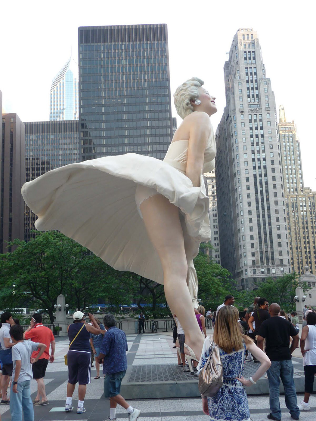
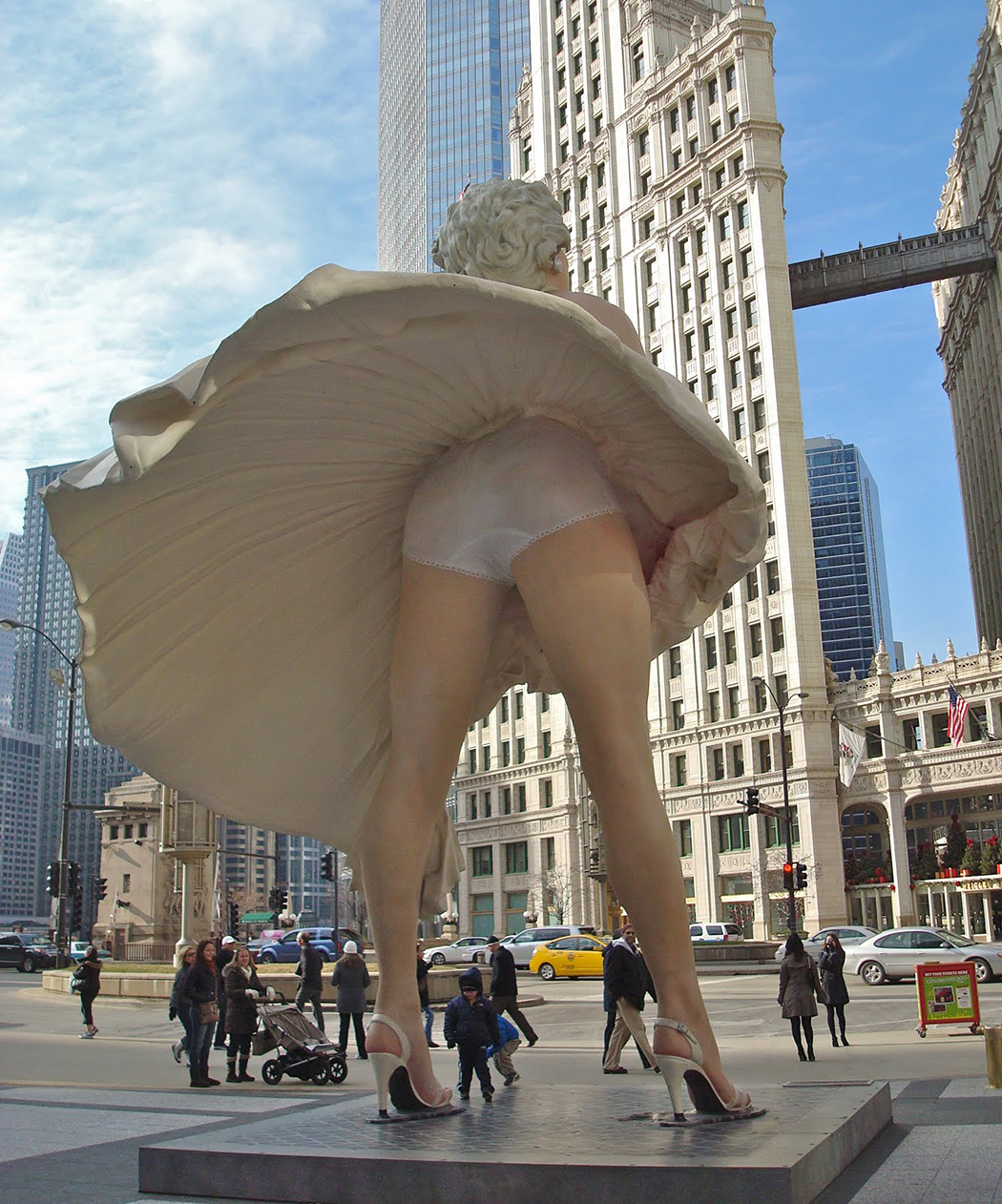
2. Seward Johnson, Forever Marilyn (2011), Chicago
What does a sculpture depicting Marilyn Monroe in a movie that pays tribute to New York City have to do with Chicago?
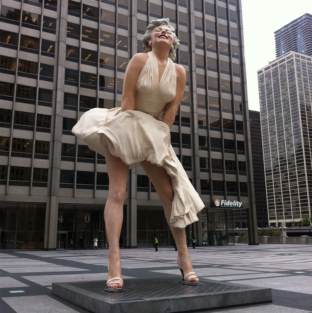
The 26-foot installation depicts a partially exposed Monroe from the movie Seven Year Itch. In addition to its irrelevance, many criticized the sculpture for its lewd and anti-feminist connotations. Its placement, meanwhile, prompted many classy photos of people gawking up her skirt, licking her legs, or pointing to her underwear.
Before it moved to California, Marilyn Monroe was vandalized numerous times. Many citizens argued that the piece of public art catered more to tourists than to Chicago residents — and they had a fair point. The monument didn’t exactly reflect the city’s character or engage positively with its community.
More pictures below – click to enlarge
– – –
3. Richard Serra, Tilted Arc (1989), New York
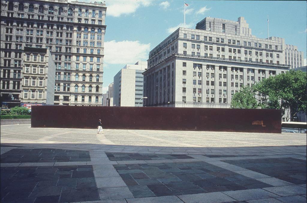
Titled Arc was at the forefront of public art controversy in the early 1980s. The saga began when minimalist sculptor Richard Serra was commissioned to create a piece of work in the Federal Plaza by the US General Services Administration.
Tilted Arc was a $175,000 piece of oppressive black, raw steel. Measuring 120 feet long and 12 feet high, the arc cut the Federal Plaza in half and forced those working in the nearby buildings to redirect their walking path in order to get through the plaza. The work did not mesh well with its surroundings — which, according to Serra, was the point. “The viewer becomes aware of himself and of his movement through the plaza. As he moves, the sculpture changes…. Step by step the perception not only of the sculpture but of the entire environment changes.”
Controversy erupted as soon as the sculpture was erected, with detractors claiming it disrupted the public use of the plaza and was an inconvenience to the workers. After a hearing and an appeal by Serra, the arc was dismantled in 1989.
4. Lei Yikin, Martin Luther King Jr. Memorial(2011), Washington DC
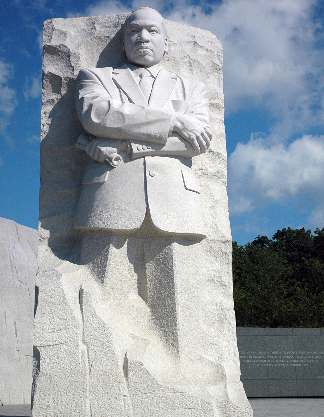
When it was announced that Lei Yikin, an artist from China, would sculpt the memorial out of Chinese granite, human rights activists criticized the selection on the grounds that Lei had previously sculpted Mao Zedong.
Many other people, most notably African-American artist Gilbert Young, demanded that the memorial be created by an African-American artist with American stone.
5. Maurice Agis, Dreamspace V (2006), County Durham, England
Known for his dreamlike, colorful, and interactive works, Agis was commissioned to create Dreamspace V in a park. The day after it was installed the artwork left its moorings and tragically killed two people.
Agis was put on trial for negligent manslaughter. Having witnessed the deaths, Agis was deeply and inconsolably disturbed, and vowed never to create such large works again.
We have all seen these handwritten flyers taped on bus stops or telegraph poles and for most of them if not all of them, they look rather boring and plain, aren’t they? This is what the New York designers at Cardon Copy must have thought and decided to do something about this.
This involves ‘high jacking’ these infamous fliers and give them a full make over in order to over powering their message with a new visual language. They are then stick back up where they were first snatched.
Art to help the community. Nice one.
See a few examples below
Related link
> Visit cardoncopy.com for more
ART-PIE
Having two sisters, Barbie dolls have been in sight most of my childhood and seemed anything but wild individuals. But maybe my sisters had a secret, a can’t tell story about these dolls.
I know there was such a story now thanks to Hollywood Tyler Shield’s collaborative work with Emma Roberts, The Scream 4 star, which gets out there what is really going on in the life of this iconic figure that is Barbie.
I knew she never liked Ken.
See more photos after the jump. Courtesy of Tyler Shields


It is such a shame that Nathan Sawaya’s new show is in New York and not in London as his art is truly fascinating and is using LEGOS bricks. I have a particular and secret love for those bricks which always take me back to sweet and happy childhood memories and playful moments. Continue reading Nathan Sawaya: the art of the LEGO brick
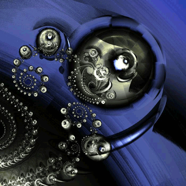
When I first heard about ‘fractal’ art, I did not have a clue what it could be so I thought I’ll investigate this further and was quickly to find out that Mr mathematics has its role to play here.
Before carrying on, it might be best to get out of the way a few terms definitions which shall shed some light on this form of art
Fractal: Rough or fragmented geometric shape that can be split into parts, each of which is a reduce-size copy of the whole. So what is ‘fractal art’ then? Continue reading Fractal art: when Mr maths is the artist