P183 is his name and Moscow his playground where he has recently dropped a series of street artworks which some will tell feels very “banksy-ish”. Banksy, British artist, first began his guerilla artwork campaign in Bristol in the early 1990s.
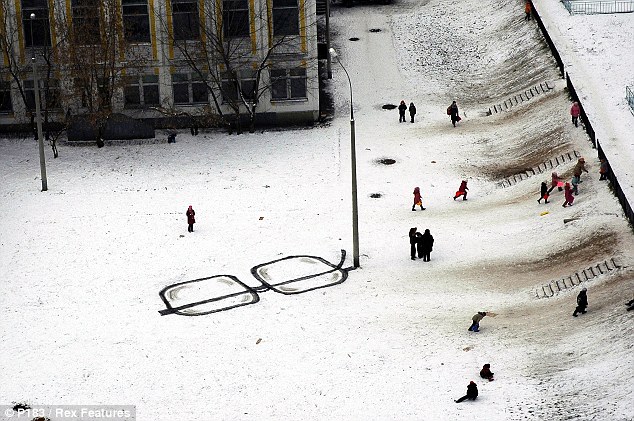
It is hard not to agree when you see some of his works below but one piece particularly caught my eye – Seeing is believing, I actually think it is very clever and is one of the best use of the urban furniture I have seen in recent street art. It uses lamp-post to double as the arm of a giant pair of eyeglasses, with the rest of the ‘frames’ drawn in the snow. Clever
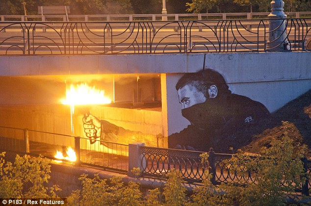
Another piece is worth mentioning too – Instigators Of Bridges. A rioter with a flare has been drawn on a flyover and fire is lit at night giving the piece another realistic dimension.
What do you reckon?
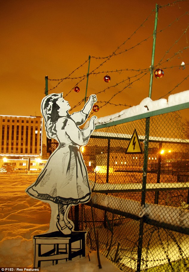
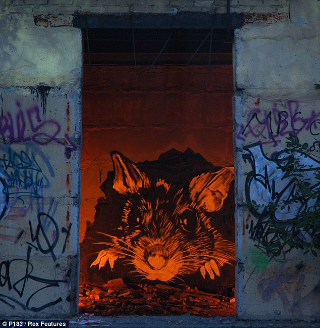
P183 - Seeing Is BelievingP183 - Instigators Of BridgesP183 - SeasonalP183 - Urban Hazard
Gaston Gouron is a visual media artist based in Brussels. His work caught my attention at a show about art books. Not by surprise, yet I think more by design, I had picked out each of Gaston’s three artworks on display before swooping in to catch a word with him. I arranged to meet two days later in Bar De Matin – BDM to those in the know – a chatty bar in Place Eugéne. I went in with having noted down a few choice questions and also the book ‘The Secret War between Downloading and Uploading’. I’d intended this as a visual prompt to get us going on a Sunday morning. Luckily too we’re both keen on our coffee! Gaston launched in by telling me that notorious mega-uploads site had just been killed-off by the US government’s new anti-piracy laws.
‘Tutt!!’ He mentioned also the group called Script-Kiddies who work anonymously, and how he was fond of subverting the hacking potential of freewares like Keylogger to the advantage of as a tool for making artwork. He also threw in the word Caviarder – but not to be cast aside, really that word defines Gaston Gouron’s working process – which for him is to make things in a simple way or with no design.
Maybe this makes him a censor of what he considers to be an over-design of things? I asked him how much he thought his work to take refuge in and show hallmarks of the graffiti artist – expressive, edgy, playful? Here is the interview.
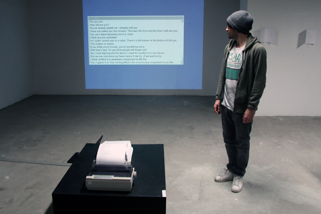
Media artist Gaston Gouron presiding over the inspired techno-language-sculpture ‘Never-ending Conversation’ at the exhibition 50 Livres D’Artistes which happened 19–21 Jan 2012 – an annual showcase of students’ work from Lacambre Arts Visuels, Brussels
PW: Please describe your working method relating to the artwork Never-ending Conversation, exhibited in 50 Livres d’ Artistes at ARA (Amis de la Reliure d’Art) Belgica in January.
GG: It’s totally process driven, and it’s about finding a moment when something flips into being interesting, no; in fact, amazing. I do this on the web, chasing links that may have been sparked by a conversations with friends or a hangover from a previous idea.
Never-ending Conversation comes off the back of me buzzing around the internet and settling on something amazing. An example is when I discovered Chatbot, a web-based AI that you can talk with. I like to have fun with things so I was cutting & pasting text between the two conversation boxes to see how absurd it could be. But instead, Chatbot was sufficiently intelligent enough and made responses to expressions how you’d expect a human conversation to go.
That conversation became the default material I wanted to work with for one of my projects. As a bee might extract and pollinate, I wanted to do the same. Taking from one place and have it settle in another. Pollinating might be stretching the bee analogy too far though. It’s not that serious, really I’m simply interested in making things feel new.
PW: The artwork which you called Never-ending Conversation is very sculptural and invades the exhibition space but also plays with text that came literally out of thin air (or more aptly, it came virtually from the chatbot’s AI). So, how do you deal with the ‘real’ and ‘virtual’ and did that affect the way you chose to exhibit the artwork at 50 Livres d’Artistes?
GG: On the one hand I’m not proud to see the work presented. In reality it should appear more disordered. I created the original version in my bedroom which is more a workspace. I’m a collector too, collecting documentation about programming language and old network cables.
In a more common workspace environment Never-ending Conversation looks more ‘gutsy’ – how you’d expect a living machine should be. But when I saw it set-up in the exhibition space it looked, well… Naked! but I understand that the conditions – or restrictions – between workspace and exhibition space are very different.
In the stark, brightly lit – and clean! – exhibition space of ARA (a space with an orthodox for presenting aesthetically-biased artbook artists) I imagine my work is more readable to an audience. But It would be a great idea to have the work redone – simply to make the sprawling technology in the sculpture more obvious, revealing more about how it was put together. I’m really aware that I don’t want to conceal any part of the process.
PW: Which technological forms tend to produce the best renditions of language or ‘text-sampling’ that you’ve seen recently?
GG: Basic plain text.
I prefer reading rather than to listen to spoken words.
I just love data.
It’s strange I know, but more recently I’ve been understanding why my work borders on being seen as simplistic – which is a good thing. One thing is knowing about a study a friend sent to me. It shows that we read in contours – going from the corner of a page to the centre. So I think I’m interested in written material. Then I think about if it should be offered up as a bound-book, a pamphlet, a techno-language-sculpture. These are vessels and simply carry the language, I’m not even sure they’re that an important part of the process. The finding and discovering is more what I’m into.
PW: What’s interesting or peculiar that you’ve discovered about the ins and outs of language when you’re thinking how it needs to appear in or affect a piece of work?
GG: It’s that English language is most important in the creation process. It’s the language of IT and because I’m working a lot with script languages, English is most widely used. My mother tongue is French, but it’s not the language of IT and because I’m into revealing all of the process I’m always going to be showing parts of script and programming language.
One other thing is that using the French language this might make my work appear to be more exotic and specialist. It’s the opposite – I want to hit on an international crowd with an equally international language and for them to read the words. If they admire the vessel in which it’s concealed, then great, but for me it’s about getting the language to speak for itself.
PW: Who has done the most, or been most instinctive, in making the printed word part of their bank of visual language?
GG: I have several references. I would say the graphic works of Marcel Broadthaer’s and he’s Belgian. Japanese artist On Kawara is a big inspiration. He made two books retracing one million years – making the words and numbers from the dates into material – which then could be bound in a book, spoken out aloud and painted on a canvas (then, showing me on the screen of his laptop) like this.
I also can’t forget North Amercian artist Ed Ruscha for his famous graphics and text paintings. In England there’s Daniel Eatock – I love his work; well more than love. It’s his approach – easy and efficient. Then there’s Vaska who is Eatock’s founding partner of the web-building-platform Indexhibit. He came into my school last year. Working together they made the most clean of interfaces.
PW: ‘Artbook’ as a category seems an anathema to your visual language because you’re looking for ways of re-doing and re-showing printed texts. I can see a binary to the way you bulk-up on language and downplay the format (or vessel as you refer). You serve-up things leaving the text in it’s raw elemental form – to fend for itself. So, how do you think your work relates to the ready-made, or made-ready?
GG: I produced Never-ending Conversation on a course I was studying at Lacambre Artes Visuels in Brussels. It was only 3 months and the course was refreshing because of the trans-disciplinary interests of the students I was studying with. Everyone doing this short-course was coming from a bigger discipline including design, photography, typography, urban space and for me it’s graphic communication. A bias is coming in too from a fine-art background but I’m also a programmer.
The tutors were really supportive an encouraged us to explore ideas. It’s completely energizing to share ideas with such a diversity of artistic personalities.
My work relates to the ready-made in process really. I do things to get rid of some idea – maybe to bank them so I can buzz on the next amazing discovery.
PW: We could go on, but thanks Gaston for the giving a nice twist to thinking about the how artbooks can still be brought to life beyond the printed and bound page.
GG: That’s OK
Gaston Gouron is currently writing his transcript for application to RCA, London.
Related: From 26 January to 6 May 2012 MAMbo – Museo d’Arte Moderna di Bologna is delighted to present Marcel Broodthaers. L’espace de l’écriture, the first complete retrospective in Italy devoted to the Belgian artist, curated by Gloria Moure.
There are quite a few light-painting based videos/animations out there these days, some very well done, some others a bit less but what about this one – “RIPPLED“, another collaboration between Darcy Prendergast and the creative team at OH YEAH WOW.
Two words – truly amazing.
You do not get perfection or beauty without pain. 6 months is how long this work took to get wrapped up and frame by frame animation and long exposure technique were how they proceeded. The camera was the weapon and the creativity topped it all off.
Take two thing a large number of us have manipulated once in their lives: LEGO and chalk. Take it further and create something too amazing for not writing something up about it. Dutchman Peter Westerink and a few other helping hands must have astonished a few by-passers with their 100m2 3D creation depicting a army of LEGO men Terracotta style.
You will see below, pictures showing the steps these guys has to go through. Oh and did I mention that it took 6 full days to a crew of four artists (Leon Keer, who also came up with the design, Remko Van Schaik, Ruben Poncia and Peter Westerink) to get this leaped out if the concrete floor. No surprise that the Sarasota Chalk Festival in Florida was chosen, imagine doing that at Glastonbury festival where it is very likely to rain and wash out a pile of efforts.
A grid is first laid out using chalk, then painted over with white paint before being removed and a mammoth task begins: filling.
Peter and his crew (and many other artists) are part of Planet Streetpainting is a collaborative of international street painters
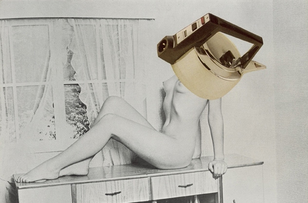
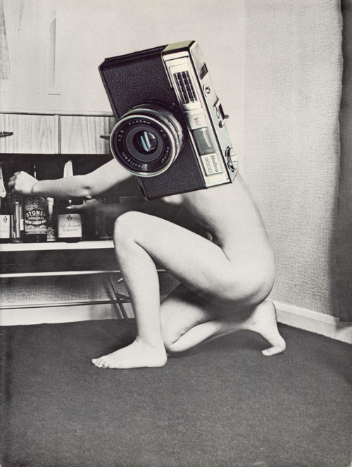
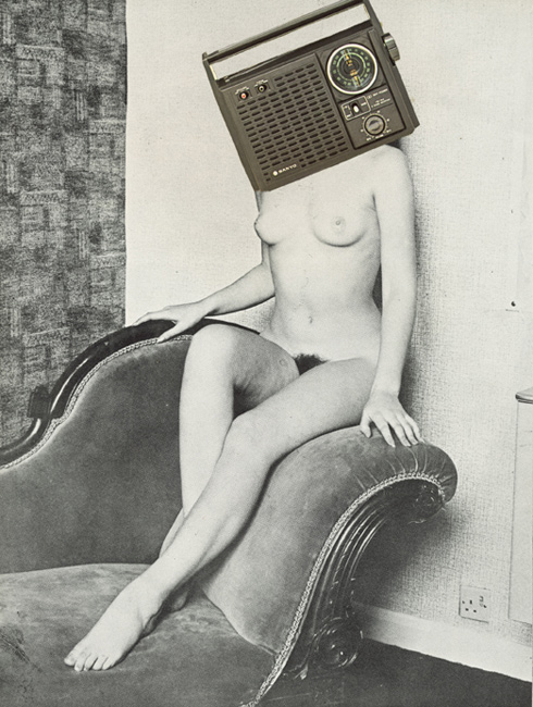
John Stezaker once said of Collage that it “is a yearning for a lost world and reflects a universal sense of loss”. Those sentiments are certainly reflected in the work of artist and radical feminist Linder Sterling (also known as Linder).
In her series Pretty Girls, Linder reacted to visual world she occupied, a society of inequality and the gender specific rhetoric. Linder used the magazines of the late 70’s and 80’s as her painters brush. Splicing images of naked women from pornography, and kitchen appliances from those awful home improvement catalogues, she created a curious and slightly disturbing, yet telling depiction on the representation of women of the time.
Looking back at these images from the 70’s and the post punk era it’s amazing how contemporary they feel. Is this due to the inherent nature of collage and it’s yearning for a lost world (as Stezaker put it). Or is it that in a time when we are bombarded with imagery on a daily basis that more and more contemporary artists and looking back in time in an attempt to decipher it all?



 Take two thing a large number of us have manipulated once in their lives: LEGO and chalk. Take it further and create something too amazing for not writing something up about it. Dutchman Peter Westerink and a few other helping hands must have astonished a few by-passers with their 100m2 3D creation depicting a army of LEGO men Terracotta style.