Mannequin to save China – Greenpeace

Time to show some support and also to expose the polluted water issue that is happening right now in China.

“Not only is China one of the world’s twenty most water deficient countries, but irresponsible corporations and slack government has made water pollution highly prevalent in China. Today, as much as 70% of all rivers, lakes, and reservoirs in China are affected by water pollution, and with each passing day the situation only gets worse.”

Greenpeace is using what can called ‘street art’ and has launched a campaign by some creative street installations across the globe recently – mannequins bearing the Chinese symbol for water – ? ‘Shui’

Some have been spotted in London, see the pictures below.

Get yourself involved and follow @Greenpeace) and search for  the hashtag XM3N. Sign up today to support the campaign and check the Greenpeace facebook page too. You will also find more information here about the water pollution in China

Color Jam

At last there is something for the “looking down while walking” individuals. There is a good reason to ignore your siblings, there is the new work from Jessica Stockholder to look at.

“Color Jam” is the name of the installation and is a make-over of State and Adams streets in downtown Chicago. A flow of colors have landed on the concrete and are licking the surrounding building.

Orange, lime green and turquoise shapes seem to wait for the bypassers in the hope of lighten these often bleak faces. Jessica Stockholder hit again with what she does best – site-specific works that merge painting to a three dimensional element.

ART-PIE - Color Jam by Jessica Stockholder

ART-PIE - Color Jam by Jessica Stockholder

Below is a photo of another installation made also in Chicago back in 2009 where brightly colored plywood platforms and metal bleachers were assembled to turn a section of Madison Square Park in New York into an abstract painting, “Flooded Chambers Maid.” Children instantly appropriated it as a playground, and adults used it as an informal seating area.

ART-PIE - Flooded Chambers Maid by Jessica Stockholder

Pure Evil at XOYO

Andy Warhol’s famous dictum that “Making money is art and working is art and good business is the best art.” in an age of media and internet saturation sounds less like an off hand quip and more a prescient statement of fact.. It is fitting then that the inspiration for the series of darkly reductive artworks created by artist Pure Evil that make up the core of the Last Good Time show was an email full of thumbnail images received from a Chinese company specializing in the reproduction of the classic canon of western artwork, produced by an entire copy village indifferently mass producing Rembrandts and Warhols .

From this spark came further artworks in a series built on the idea of the tragic muse, the ‘POP’ combustibility of creative relationships and the dark side of the classic glamour of the age prior to tabloid overload, seen through the ghostly tear filled eyes of Elizabeth Taylor, Li Tobler, Sylvette Davide or Brigitte Bardot.

When – 5/8 till 8/9/11 (Preview this thursday 4/8/11, 6pm)
Where – XOYO | Cowper Street | London — EC2A 4AP

The Rebel Journey, a book by Hogan Rebel

The Rebel Journey by Hogan Rebel | Art-Pie

Hogan Rebel recently released his book Rebel journey: Dream-Believe-Create
, narrating the career of a dozen of famous modern rebels, and defining the founding values of the Hogan Rebel lifestyle collection.

We were asked to look closely at one of these artists, Paola Pivi, to come up with a quote for an upcoming video. You can see the video below.

Here are a few words from the artist herself –

What’s your definition of rebel?
Not a sheep, not a wolf.

Who do you consider rebel?
Somebody who creates their own system.

What’s your dream?
Freedom and peace, which I lost the day I saw somebody was about to abuse a person I love and I started a trial to try to defend him.

In what you believe?
Now that I see on my own skin how unbelievably hard it is to try to stop bad actions in other men, I respect whoever did something like this.Why man creates?To develop our brain.

——-

The Rebel Journey, a book by Hogan Rebel

Designs of the Year

I must admit I don’t often think about how design is all around me. I could say it is embedded in my life, from when I wake up to when I go to bed. My alarm clock, the typography in my book, the label on my favourite bottle of plonk and the lamp I switch off at night.

If you think design is just function, think again. Immerse yourself in the top floor of The Design Museum with their Designs of the Year exhibition.

This array of international pieces span: Architecture, Digital, Fashion, Furniture, Graphics, Product and Transport. Feast your eyes on this ‘look book’ across the design spectrum for the museums Design Awards. A high profile judging panel decide the best entries in each of the seven categories. The category award winners and the overall winner of the Design of the Year Award shall be announced in April 2012.

Turning function on its head, the Design Museum display also includes works poking fun at design in computer functions with – Your Browser Sent A Request That This Server Could Not Understand – an illustrated depiction of the internet by Koen Taselaar.

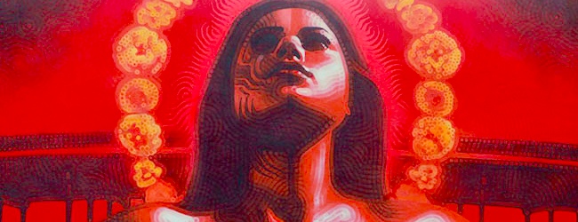
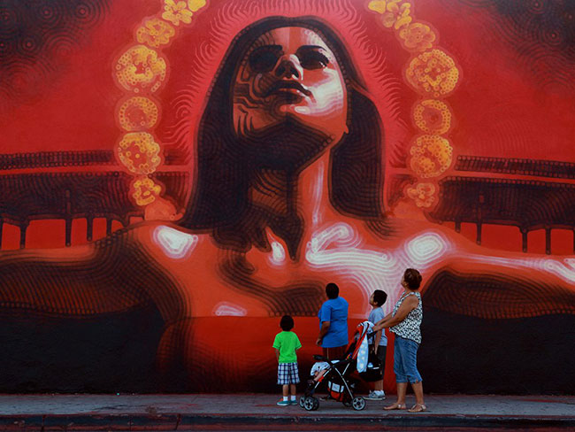
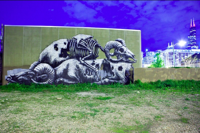
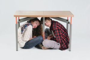
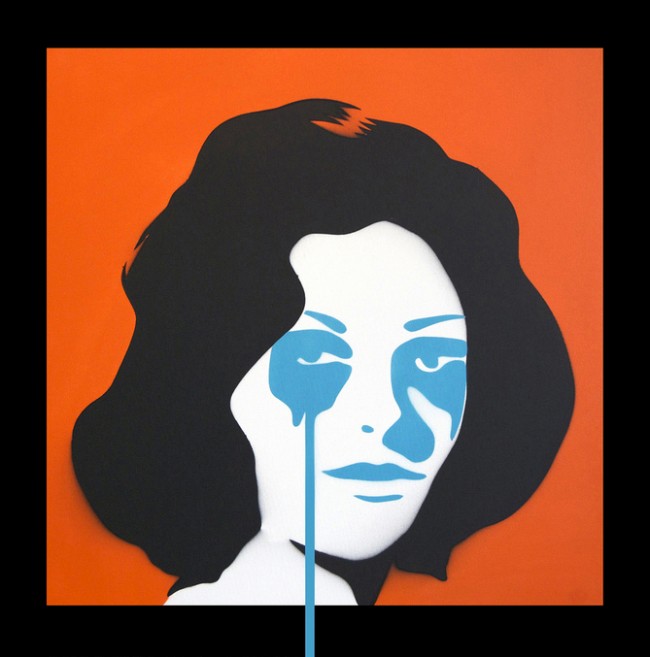
Designs of the Year looks outside the box; not just new spangled technology or expensive materials. Noma Bar (above) produces simple shapes, that reveal hidden possibilities, whose negative and positive spaces draw the eye every time. There are designs that are simplistic, that save lives. The Earthquake Proof Table by Arthur Brutter and Ido Bruno (below) is astonding in its clean back to basics design that could help thousands.


The Earthquake Proof Table


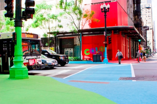
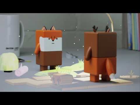
Shopping online and on the move is nothing new but South Korea have taken mobile and digital aspects to the next level. Homeplus Tesco Virtual Store is the result – below. Choose your item from their virtual store!

Holographic shopping en route home?Augmented reality is given a breath of fresh air by Swappu, creating a ‘holo-deck’ feel, well, okay it’s not quite up to Star Trek level. The animations are great and the playfulness of it will be a hit for kids. Its a soft and easily lovable digital world that shall no doubt advance rapidly.

See the app in action here > http://www.youtube.com/watch?v=sBmLWdjtzPw

© 2012 Dentsu London

One Thousand Cranes for Japan is a charity project that aims to inspire and bring people together to be part of a final creation. Members of the public can choose, download and print off the paper designs to fold into their own origami creation. A chance to be part of the designs final creation, it’s nothing groundbreaking, but it’s not meant to be.

Image by Anomaly/Unit9  anomaly.com

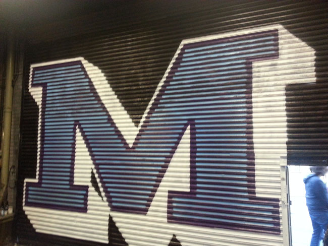
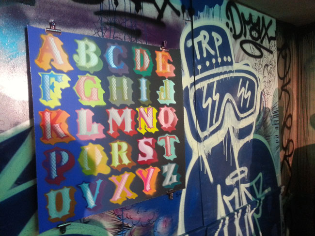
The Comedy Carpet (below images) takes typography bold and big. It reminds us font is more than just Arial and Times New Roman selected on a computer screen. This gigantic installation, created by Why Not Associates, sprawls out in front of the Blackpool Tower and features over 160,000 granite letters embedded in concrete. It refers to the work of more than 1,000 comedians and comedy writers, giving a visual form to jokes, songs and catchphrases.

The Comedy Carpet in progress

Comedy Carpet, Blackpool

The Crates (below) by Naihan Li & Co is a product that is a must for the clothes obsessed, and those who need organisation of all their essential fashion items. See just how functional a plain industrial looking crate can be, reacting to our clothing hoarding and need for storage.

This work is in stark contrast to Sarah Burton‘s now infamous handmade lace that’s delicately on display. This painstakingly handcrafted work was stitched into the nations memories on Kate Middleton’s wedding dress.

The wide spectrum at the Designs of the Year should open up your eyes to the flexibility and intricacy of design and its ability to problem solve, whilst looking back to the past for inspiration.

With mass market production all to easy to snub, design is at an exciting point; using mass production processes to save lives but taking us back to simplicity, creating unique angles on our lives.

The Designs of the Year exhibition runs 8 February – 4 July at The Design Museum. For tickets and information click me!

Robert Brandenburg at Gallery 1988

In “Pooh… and Other Sh*t,” Robert Brandenburg brings “hijacked” art to Gallery 1988 in Venice Beach, CA.

As a self-taught artist from Ohio, Brandenburg brings an expansive perspective to viewers. Born in 1954, he paints contemporary works that offer a light repose from the mundane.

His versatile style allows him to incorporate renderings into a variety of works on a variety of mediums. Less art than humor, he creates an entertaining interlude and encourages viewers to recreate everyday scenes in a less than ordinary manner.

Renamed The Bird, Brandenburg alters a metal sign from 1956 used to advertise the Ford Thunderbird. In the original a couple speeds away in the automobile, waving to onlookers. In the re-mastered version, the passenger extends her middl
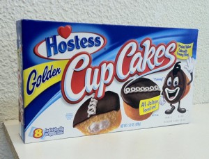
e finger to the people standing by. From metal to cardboard, In Mammy Cakes Brandenburg alters a Hostess Cupcake box from a chocolate frosted vanilla cupcake to a white mouthed image mirroring minstrel shows that ran in America from the 1830’s into the mid-1900’s. During these often severely racist performances, white men painted themselves in black face.

To compliment his images, Brandenburg includes brief bios and explanations into the life of his creations. One of his works, Hannah Lecter, features a young girl on a greeting card. Originally, she was eating a tasty piece of chocolate but Brandenburg coated the original snack with a dripping red acrylic paint to make it appear as if she indulges in human flesh.  The title and corresponding story names her as Hannibal Lecter’s love child. He also alters several Norman Rockwell paintings depicting the ‘ideal’ family life of 1940’s America including one from Rockwell’s “Four Freedom” series entitled Freedom from Want. 
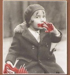
Brandenburg redubs it Freedom from Stress and replaces the original turkey with a glass pipe, beers, and whiskey explaining, “experience suggests that the happy family is going to need a little more than turkey to keep things running smoothly for the rest of the day.”

Brandenburg brings a fresh look to “normal” images by incorporating himself into a variety of mediums at his new solo exhibition. By redesigning iconic images, he urges society to reexamine omnipresent sights that do not always reflect truth.

“Pooh… and Other Sh*t” hijacked art by Robert Brandenburg at Gallery 1988 Venice
Dates: January 7 – 28, 2011
Hours: Wed – Sun: 11AM – 6PM

Ben Eine’s ‘Tenderloin’ A-Z showcase

Ben Eine | Art-PieWhen I first read about this event from my inbox, I must admit I got quite excited as Ben Eine and his work are exciting. If you love colours, letters and typography, you will appreciate this artist’s work.

“The venue will be announced just before the show and via Nelly Duff’s social medias”. This was enough to convince me that we were on something good.

I was wrong. What the show had to offer was a series of pieces with the whole alphabet broken down in a multitude of versions, different colours, not coloured at all, this sort of things. It did not take me long to go round the whole venue to have seen it all. I actually must more enjoyed the old graffiti and tags spread all around the venue from old jams or other shows.

I have not mentioned the launch of of ‘The World Atlas of Street Art & Graffiti by Dr Rafael Schacter that happened that night too just because, let’s be honest, the hype around Ben Eine did a good job by bringing people in and to get the copies of the book flying off the shelf…

We took a few pics anyway.

Ben Eine | Art-Pie

Ben Eine | Art-Pie

Ben Eine | Art-Pie

Ben Eine | Art-Pie

Ben Eine | Art-Pie

Ben Eine | Art-Pie

Star Wars characters does the Eighties style

Artist Denis Medri gives us his vision on how would several Star Wars characters look like if they were from the Eighties. This series is awesome and Denis, beyond is obvious pencil drawing skills, managed to cleverly transpose two worlds miles apart.

Have a look at the pictures below along with the artist’s comments –

“of course Luke is inspired by Marty McFly form Back to the Future… Leila is the classic 80’s chick…”

Denis Medri's Star Wars | Art-Pie

“Here is Han and Chewbie ,and the Millenium Falcon/Trans AM”

Denis Medri's Star Wars | Art-Pie

“Of course in this new re-design the Droids have to be the classic Nerds… is R2-D2 the East European nerd student that made an experience in USA of course only C-3PO understand his words..”

Denis Medri's Star Wars | Art-Pie

“Yoda is the old sage asian Coach, and Kenobi is the kind history & Literature’s teacher…”

Denis Medri's Star Wars | Art-Pie

“In this my new version of SW , Vader isn’t the Luke’s father, but is the classic bullit of the High School, that try to bring Luke to the “dark side” and been bullit too.. He is the “chief “of a motocross crew of bullit ( like “Karate Kid” or “Lost Kids”) He wear a jacket like Micheal jackson on “Thriller” in a total black look Boba Fett is his “sidekick” wearing his classic 80’s glasses and we have 2 twins that look like Trooper”s style.”

Denis Medri's Star Wars | Art-Pie

“Palpatine is the evil Principal, Jabba the fat bastard Janitor and Tarkin the severe Mathematic-Science’s teacher”

Denis Medri's Star Wars | Art-Pie

Medri is the same artist who brought us Steampunk Spider-Man and Batman Rockabilly.

STREET ART