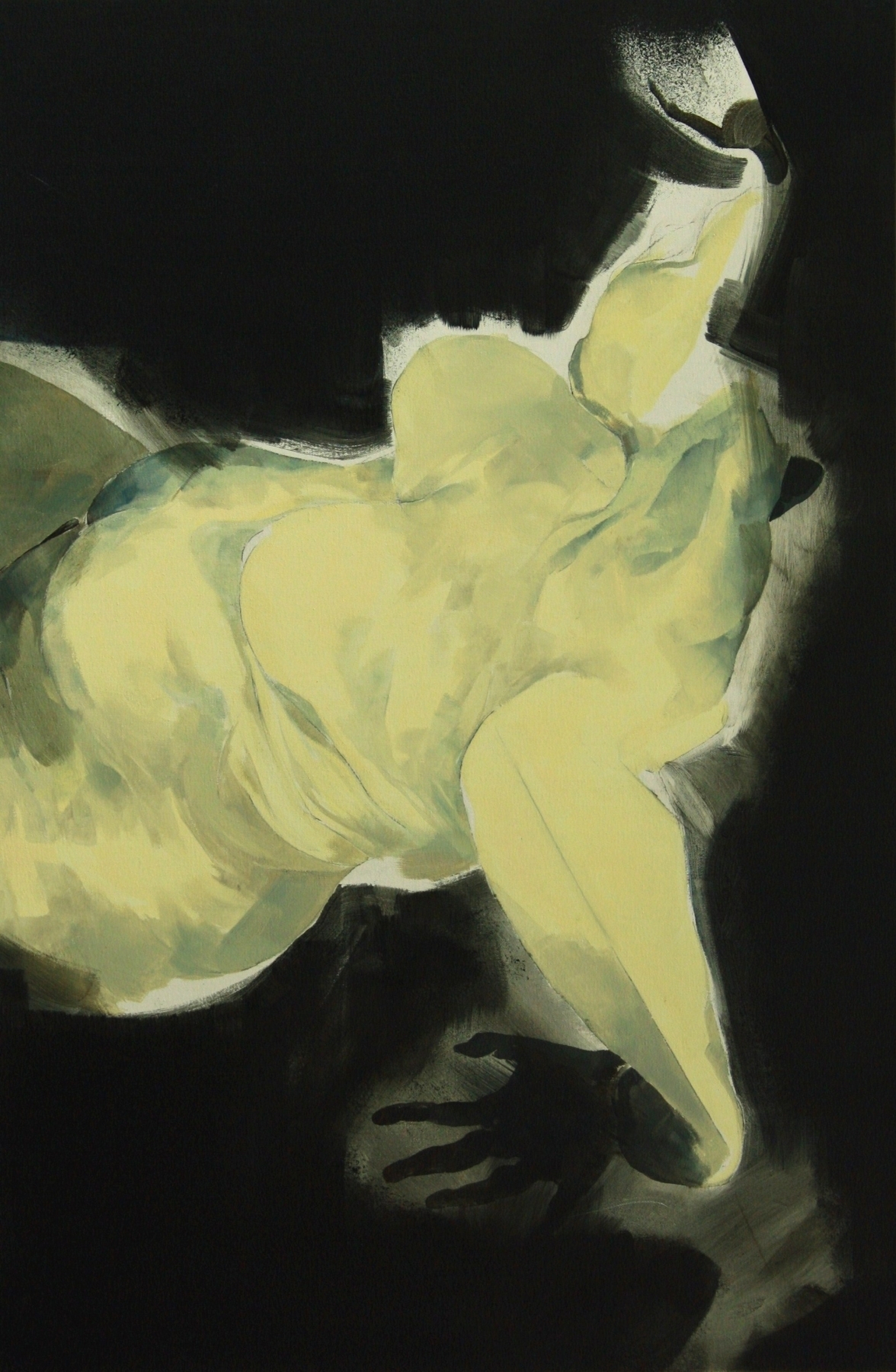
Untitled Nude, (c)2011 Shireen Qureshi, oil and charcoal on canvas
I recently interviewed London artist Shireen Qureshi for This ‘Me’ of Mine. Her ‘Untitled Nude’ is a compelling expression of the struggle in the violence of existence; of being flesh and bone. We discussed an interesting point of the Deleuzian ‘event’…
Jane Boyer: Deleuze suggests we are an event; meaning that out of a chaos in which conditions have come together to form a ‘one’ or have passed through ‘a screen’ which allows something rather than nothing to happen.[1] There is a sense of ‘event’ in your tableaus and the figures are that ‘event’, as if we are witnessing the coalescing of a self, how do you see this? Do you feel the passage of time is relevant to the self?
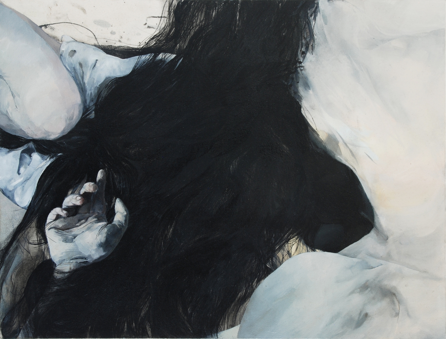
Shireen Qureshi: It is interesting that you suggest that we are witnessing the coalescing of a self in my work because in my mind I am more interested in breaking down the body, of rupturing boundaries. I often initiate a painting by making it look real and then trying to break it down, by overlapping bodies or breaking apart skin and bone, I suppose in that sense the aim for me is towards chaos rather than from it. But I think that this is a very interesting idea, especially the sense of an ‘event’ you describe in my work, forcing my viewers into the role of witness. I think that if the paintings have created any sense of inescapable drama pinning both my figures and viewers in place, then this is an achievement in itself. From my point of view, the passage of time is interesting because it is within a space of time that metamorphosis and transformation can occur. I would like to create a sense of movement, an undulation within each of my paintings as if they were bubbles of captured space and time. I think that time is inescapably relevant to the self because it is within time that a self is built or deconstructed, subjected to the violence of existence, and within which the self moves, inevitably, towards death.
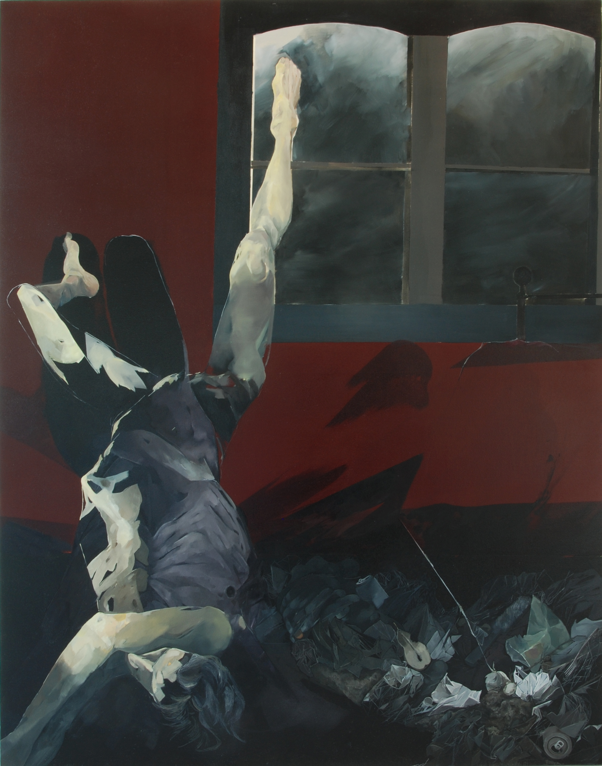
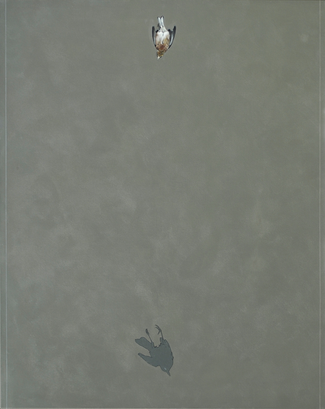
Fall, (c)2010 Shireen Qureshi, oil on canvas
Whether we think much about it or not, we live every moment of our existence with the thought of our extinction – every one of us could cease to exist at any moment. This latent threat is one aspect of the ‘violence of existence’ mentioned by Shireen. From her point of view the violence exists in the visceral reality of living in flesh and bone, a violence we understand first hand. Often through serious illness or accident, the loss of loved ones or violent personal threat we realize the fragility of our existence and the latent threat of our extinction become a conscious reality. Once aware of this imminence our sense of self undoubtedly alters; we become a self with limited time.
The visual breakdown of bodies, flesh and bone is an interesting interpretation of this psychological awareness of our mortality. The ambiguity of whether the bodies in Shireen’s paintings are coalescing or breaking down is indicative of the struggle in the moment of ‘difference’ described by Deleuze, and as such, is also the ‘violence of existence’ Shireen speaks of. Deleuze said, “Indifference has two aspects: the undifferentiated abyss, the black nothingness, the indeterminate…in which everything is dissolved – but also the white nothingness, the…calm surface upon which float unconnected determinations like scattered members: a head without a neck, an arm without a shoulder, eyes without brows. The indeterminate is completely indifferent, but such floating determinations are no less indifferent to each other. Is difference intermediate between these two extremes [the undifferentiated and the determinate]? Or is it not rather the only extreme, the only moment of presence and precision?”
Hand in Hair, (c)2010 Shireen Qureshi, oil on canvas
He continued, “There is cruelty, even monstrosity, on both sides of the struggle against an elusive adversary, in which the distinguished opposes something which cannot distinguish itself from it but continues to espouse that which divorces it.”[2]
Living is difference; it is the precision of presence. Living with the imminence of our extinction is the violent struggle of divorcing that which continues to espouse us; a struggle “within which the self moves, inevitably, towards death,” as Shireen says.
Read more of our interview, ‘Straight from the Nerves’ on the This ‘Me’ of Mine blogsite.
Peripheral Vision, (c)2010 David Minton, oil on canvas
But it may be that without meaning there is only space, so in a sense I make my paintings by accident, but knowingly so. The central space created by painting ‘at the periphery’ has a tension that is constantly pregnant with possibility. In order to remain so, the tensions of space are never resolved, but continue and it is this continued lack of resolution that forms the overall content of the picture.[1] Perhaps what’s missing is what’s outside that loop or the fear of its ceasing to be a loop and become something that runs forward in time. All those fears and hopes, everything the intimacy within the home brings, begins to open up to a greater loss and eventually time will bring the loss of things because of the infinite nature of time; everything outside of time is infinite.[2]
At art college we were encouraged to self-analyse our output and I found myself not fully understanding how I travelled from initial concept to final outcome. So, now I find it useful to think of myself as a black box where every new line of enquiry has the potential to reveal more of my inner (often hidden) self and my motivations for doing what I do.[3] Initially it was very important to move away from outward observation, it came out of necessity for me, and I had to close myself off from the real world for a while although outward observation is creeping back into the work acting as little anchors.[4] All that is visible is a barely responsive exterior… This indifference, characteristic to the figures in my paintings, suggests the social is almost taken away. You wonder what is revealed in this state of consciousness, just mindless projections on to others perhaps.[5]
Woman with Cardigan, (c)2010 Melanie Titmuss, oil on canvas
This play on words, mixing up sentences from each artist interviewed so far for This ‘Me’ of Mine, is not intended as a clever ploy at meaning-making, but rather a look at the interconnectedness of the issues of the self and identity. Each of these artists is concerned in their own way with issues of self in their work. It is fascinating for me as curator to see how their concerns link together in the universal struggle to self-identify; something which I hope will become evident through these interviews.
Join us in the on-going discussions. Go to INTERVIEWS at the This ‘Me’ of Mine blogsite to read more from David Minton, Anthony Boswell, David Riley, Aly Helyer and Melanie Titmuss, the artists interviewed and quoted above (see credits below for links to the individual interviews).
Interviews coming up: Sarah Hervey, Shireen Qureshi and Sandra Crisp. Waiting in the wings: Kate Murdoch, Annabel Dover, Edd Pearman, Cathy Lomax, Hayley Harrison, and Darren Nixon. Art Historian and critic, Becky Huff Hunter, is kindly interviewing me and that will be coming up too.
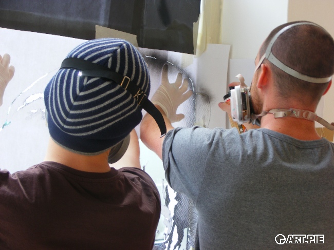
We met up earlier today with Tom and Craig, better known at WeLikeStatic to have a sneak peak at their solo show opening tomorrow at Whisper Fine Art on Eastcastle street, London.
The place was buzzing with still “loads to do” but the team was at it and the display was shaping up nicely; this show, I could tell, will be a good one. Portraiture is what this show will try to tackle and we all know that it is rather an hazardous path to take, it does not take long to get it wrong and bore your audience with lifeless portraits, emotionless figures.
WeLikeStatic has managed with this new set of works to actually put the actual character depictation at a second plan and rather draw your attention to the making process of their pieces of art, this is for sure what got me interested here anyway.
“Look at it straight on and it will appear as one dimension work, but do two steps to left (or to the right) and a multi-layered artwork fades in front of your eyes”, giving a complete and unique take to the viewer’s eyes.
Spray paint, acrylic, screen printing, stenciling on layers of glass, Perspex and aluminum, you name it. A rather inpressive bunch of techniques and mediums got into that show which has been in preparation for months, we were told. And the result is something quite unique or in line with a trend I first had contact with when I encountered Adam Neate’s shows at the Elms Letters Painting Rooms: three dimensional art made of 21st century material – Perspex.
We also got a glimpse of the making of the front window display – the now recognizable space woman face. So far it looked like it will be ace. I cannot wait to see the end result tomorrow.
RSVP to Ruth at ruth@whisperfineart.co.uk, who will make you some lovely tea if you get there completely soaking wet, and lose your mind in the layered world of WeLikeStatic art
When – 27-28 Eastcastle Street, London W1W Where – Private view on the 26/04/2012 | Show runs until 26/05/2012
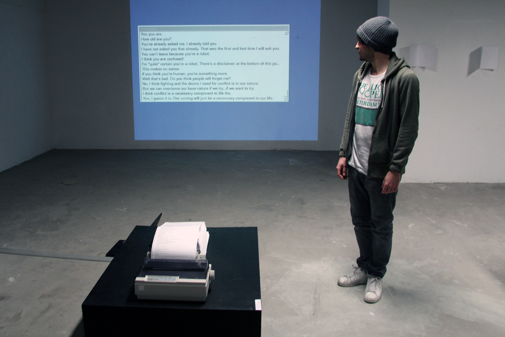
Gaston Gouron is a visual media artist based in Brussels. His work caught my attention at a show about art books. Not by surprise, yet I think more by design, I had picked out each of Gaston’s three artworks on display before swooping in to catch a word with him. I arranged to meet two days later in Bar De Matin – BDM to those in the know – a chatty bar in Place Eugéne. I went in with having noted down a few choice questions and also the book ‘The Secret War between Downloading and Uploading’. I’d intended this as a visual prompt to get us going on a Sunday morning. Luckily too we’re both keen on our coffee! Gaston launched in by telling me that notorious mega-uploads site had just been killed-off by the US government’s new anti-piracy laws.
‘Tutt!!’ He mentioned also the group called Script-Kiddies who work anonymously, and how he was fond of subverting the hacking potential of freewares like Keylogger to the advantage of as a tool for making artwork. He also threw in the word Caviarder – but not to be cast aside, really that word defines Gaston Gouron’s working process – which for him is to make things in a simple way or with no design.
Maybe this makes him a censor of what he considers to be an over-design of things? I asked him how much he thought his work to take refuge in and show hallmarks of the graffiti artist – expressive, edgy, playful? Here is the interview.
Media artist Gaston Gouron presiding over the inspired techno-language-sculpture ‘Never-ending Conversation’ at the exhibition 50 Livres D’Artistes which happened 19–21 Jan 2012 – an annual showcase of students’ work from Lacambre Arts Visuels, Brussels
PW: Please describe your working method relating to the artwork Never-ending Conversation, exhibited in 50 Livres d’ Artistes at ARA (Amis de la Reliure d’Art) Belgica in January.
GG: It’s totally process driven, and it’s about finding a moment when something flips into being interesting, no; in fact, amazing. I do this on the web, chasing links that may have been sparked by a conversations with friends or a hangover from a previous idea.
Never-ending Conversation comes off the back of me buzzing around the internet and settling on something amazing. An example is when I discovered Chatbot, a web-based AI that you can talk with. I like to have fun with things so I was cutting & pasting text between the two conversation boxes to see how absurd it could be. But instead, Chatbot was sufficiently intelligent enough and made responses to expressions how you’d expect a human conversation to go.
That conversation became the default material I wanted to work with for one of my projects. As a bee might extract and pollinate, I wanted to do the same. Taking from one place and have it settle in another. Pollinating might be stretching the bee analogy too far though. It’s not that serious, really I’m simply interested in making things feel new.
PW: The artwork which you called Never-ending Conversation is very sculptural and invades the exhibition space but also plays with text that came literally out of thin air (or more aptly, it came virtually from the chatbot’s AI). So, how do you deal with the ‘real’ and ‘virtual’ and did that affect the way you chose to exhibit the artwork at 50 Livres d’Artistes?
GG: On the one hand I’m not proud to see the work presented. In reality it should appear more disordered. I created the original version in my bedroom which is more a workspace. I’m a collector too, collecting documentation about programming language and old network cables.
In a more common workspace environment Never-ending Conversation looks more ‘gutsy’ – how you’d expect a living machine should be. But when I saw it set-up in the exhibition space it looked, well… Naked! but I understand that the conditions – or restrictions – between workspace and exhibition space are very different.
In the stark, brightly lit – and clean! – exhibition space of ARA (a space with an orthodox for presenting aesthetically-biased artbook artists) I imagine my work is more readable to an audience. But It would be a great idea to have the work redone – simply to make the sprawling technology in the sculpture more obvious, revealing more about how it was put together. I’m really aware that I don’t want to conceal any part of the process.
PW: Which technological forms tend to produce the best renditions of language or ‘text-sampling’ that you’ve seen recently?
GG: Basic plain text.
I prefer reading rather than to listen to spoken words.
I just love data.
It’s strange I know, but more recently I’ve been understanding why my work borders on being seen as simplistic – which is a good thing. One thing is knowing about a study a friend sent to me. It shows that we read in contours – going from the corner of a page to the centre. So I think I’m interested in written material. Then I think about if it should be offered up as a bound-book, a pamphlet, a techno-language-sculpture. These are vessels and simply carry the language, I’m not even sure they’re that an important part of the process. The finding and discovering is more what I’m into.
PW: What’s interesting or peculiar that you’ve discovered about the ins and outs of language when you’re thinking how it needs to appear in or affect a piece of work?
GG: It’s that English language is most important in the creation process. It’s the language of IT and because I’m working a lot with script languages, English is most widely used. My mother tongue is French, but it’s not the language of IT and because I’m into revealing all of the process I’m always going to be showing parts of script and programming language.
One other thing is that using the French language this might make my work appear to be more exotic and specialist. It’s the opposite – I want to hit on an international crowd with an equally international language and for them to read the words. If they admire the vessel in which it’s concealed, then great, but for me it’s about getting the language to speak for itself.
PW: Who has done the most, or been most instinctive, in making the printed word part of their bank of visual language?
GG: I have several references. I would say the graphic works of Marcel Broadthaer’s and he’s Belgian. Japanese artist On Kawara is a big inspiration. He made two books retracing one million years – making the words and numbers from the dates into material – which then could be bound in a book, spoken out aloud and painted on a canvas (then, showing me on the screen of his laptop) like this.
I also can’t forget North Amercian artist Ed Ruscha for his famous graphics and text paintings. In England there’s Daniel Eatock – I love his work; well more than love. It’s his approach – easy and efficient. Then there’s Vaska who is Eatock’s founding partner of the web-building-platform Indexhibit. He came into my school last year. Working together they made the most clean of interfaces.
PW: ‘Artbook’ as a category seems an anathema to your visual language because you’re looking for ways of re-doing and re-showing printed texts. I can see a binary to the way you bulk-up on language and downplay the format (or vessel as you refer). You serve-up things leaving the text in it’s raw elemental form – to fend for itself. So, how do you think your work relates to the ready-made, or made-ready?
GG: I produced Never-ending Conversation on a course I was studying at Lacambre Artes Visuels in Brussels. It was only 3 months and the course was refreshing because of the trans-disciplinary interests of the students I was studying with. Everyone doing this short-course was coming from a bigger discipline including design, photography, typography, urban space and for me it’s graphic communication. A bias is coming in too from a fine-art background but I’m also a programmer.
The tutors were really supportive an encouraged us to explore ideas. It’s completely energizing to share ideas with such a diversity of artistic personalities.
My work relates to the ready-made in process really. I do things to get rid of some idea – maybe to bank them so I can buzz on the next amazing discovery.
PW: We could go on, but thanks Gaston for the giving a nice twist to thinking about the how artbooks can still be brought to life beyond the printed and bound page.
GG: That’s OK
Gaston Gouron is currently writing his transcript for application to RCA, London.
Related: From 26 January to 6 May 2012 MAMbo – Museo d’Arte Moderna di Bologna is delighted to present Marcel Broodthaers. L’espace de l’écriture, the first complete retrospective in Italy devoted to the Belgian artist, curated by Gloria Moure.
ART-PIE: Your show is inspired from the tragedy from the 20’s coming from society icons; their highs and lows, a period was also called Jazz Age. Do you like Jazz and did it play a role in your new compositions? Pam Glew: I wasn’t a massive jazz fan before making the work for the show, I think jazz divides people, love it or hate it, a bit like marmite. I have warmed to it, after digging around for research on the 1920s stars of the time like Kid Ory and King Oliver’s Band, I now kinda love jazz musicians, the old guys with a look of wear and tear. I think its the trumpet players cheeks that do it for me.
I based most of the show on socialites, flappers, movie stars and pioneers at the time. The aviators Amelia Earhart and Charles Lindbergh (Lucky Lindy) are my new heroes.
A-P: You are using authentic materials for this show, the same you could find at its time. Has it been difficult for some to get hold of? P-G: Pretty hard, i think i have also exhausted the supply of 48 star American flag, you used to be able to get hold of them pretty easily, but now they are rare. And the 1920 quilts and crewel-work pieces were sought after, i had to hunt them down.
A-P: And what is the one you like most? P-G: I like the 1920s quilts that i used for After Hours and Charlie Chaplin, it really evokes that time and looks precious. They are curiously thin, and when i used the burn out technique they just look so delicate, but still are quite strong and resilient. i think the 2 blue quilts are my favourite works in the show. But there is 15 new works on fabric, so my favourites change by the day.
A-P: Could you tell us how the technique you used for the body of your new work differs from how you normally execute work? P-G: It’s the same bleaching technique as i use for the flags, its literally either bleach applied free-hand with a sponge, or paint brush, and then its washed out, dried, ironed, and re-bleached about 5-10 times until its light enough and the face appears. I also use a ‘burn out’ technique which paints on clear and only shows when you use steam, so that process is like magic.
I made some of the fabrics like in Profane Angel and The Band, they are made by patchwork quilt-making, it takes so long but worth it! I also made some work on aluminium, using spray paint, they will be downstairs in the gallery in the ‘prohibition bar’ which houses a retrospective print show of limited editions and rare burn out prints on vintage fabric.
A-P: How long for have you been working on this show? P-G: I started researching it last summer, watching silent movies, reading biographies of the silent movie stars, and gathering the antique fabrics. I begun making the work after my last solo, which opened November last year, so a good 6 months.
A-P: You often exhibit at charity shows, have you got any more coming up before you next solo show in New York? P-G: Yes I will be showing in Dallas for the MTV’s Staying Alive Foundation exhibition at Goss-Michael Foundation Gallery, which is a nonprofit forum for British Contemporary art, all proceeds will going to help the Staying Alive Foundation continue its fantastic and vital work enabling young communities to combat HIV/AIDS at grass roots levels around the world. It is such a good cause, so I’m really excited to be involved, that is around September this year. And then the solo in NYC will follow that, so I’m starting work on the NYC show as soon as Beautiful and Damned goes up tonight.
We thank Pam for taking time for this interview and wish all the best for the show. You can see a few pics of some of her compositions for the Beautiful & Damned show which will run until the 29th May 2011


 We met up earlier today with Tom and Craig, better known at