INSA collaboration with Pepsi Max

We tend not to plug any commercial stuff on this site but we are happy to do this time since the end result is pretty kick-ass.

About

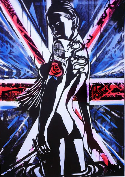
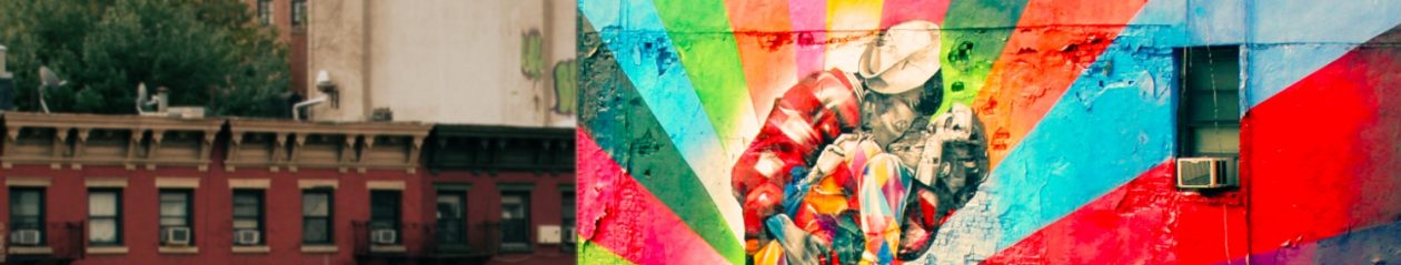
Pepsi MAX asked people to tell them about the Pepsi Max Cherry and then got artist INSA involved in order to bring to life their words and opinions – we will focus here on the animated GIF outcome and not on the taste of that drink 🙂

British musician Charli XCX made the soundtrack for this animation

How they produced the video below?

A 360 degree camera rig was built around the installation using 90 cameras, allowing every angle of the art to be captured simultaneously.

Each artwork was painted twenty four times over, layer upon layer, so they would animate when put together using stop motion.

Millions of people have watched the video now. That is part of what speaks to youths about such collaborations, INSA tells Marketing: “The young people that are Pepsi’s audience are so used to engaging with things so flippantly and getting instantaneously satisfaction, but knowing that that instant took a whole load of time and effort to make gives that human element within the digital stuff.”

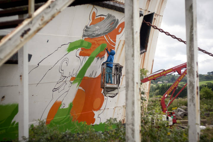
This form or art is called “Gif-iti”, Gif- what sorry?

In this other video below, INSA tells us about how what it’s called GIF graffiti (“Gif-iti”) came about and shows us the “behind the scenes” of another project he was involved with involving a satellite from space.

If you cannot be bothered to watch the video, here is how “Gif-iti” is created – GIF-ITI is made via a laborious physical process involving numerous layers of painting and meticulous planning.

Starting where most artwork ends, GIF-ITI entails photographing each layer the artist paints by hand. These images are then uploaded and overlaid to create the final piece, a looping GIF file which comes to live when released to global audiences online.

Read more on Insa & GIF-iti

Black Duke Art

A LATVIAN artist, who’s work can be found in a number of European locations, has been revealed as the person responsible for the two giant pirate murals that have recently appeared on an iconic landmark, on the North Wales Coastline.

The two pirate-like characters seemed to appear overnight, earlier this month, on the side of The Fun Ship, formally The Duke Of Lancaster, which has become a well-known landmark in Llanerch-y-Mor, near Mostyn. It has now been confirmed that they are the work of KIWIE, a street artist from Latvia.

The artwork appears to be orchestrated by a group calling themselves Dudug, who have set up a website reporting on the works. Shortly after the murals appeared on the 17th August, a You Tube video was posted on their site.

The video depicts the work being done illegally at night; however a new video has since been added to the website, revealing the original version to be a spoof. The intricate artworks did in fact take a number of days to complete, and was done under the watchful supervision of site security, which remains 24 x 7 at The Duke.

The painted characters, also known by the term KIWIES, are each 9 metres in height making them the biggest works ever created by the artist. They also include some key details about the Duke’s history in their design – with the year the ship was built (1956) on the blue pirate’s ear, and the year the ship was docked in Llanerch-y-Mor (10th Aug 1979) on its stomach.

Members of the Duke of Lancaster Appreciation Society (DOLAS) have been so far unable to shed any light on the appearance of the artwork but it appears none of them had any idea the cruise liner was going to be targeted by the street artist. It can also be confirmed that DOLAS and DUDUG operate completely separate from one another.

BLACK DUKE from KIWIE on Vimeo.

www.dudug.co.uk

www.dukeoflancaster.net

www.kiwie.com

Nawer x Remi Rough wall at Traffic Design Festival

Another day, another pair at it, another sexy piece from Remi Rough who was invited to collaborate with Nawer on a new mural which announces the upcoming Traffic Design Festival

For those familiar with Remi Rough’s stuff, this piece is immediately recognisable and true to the artist’s style in terms of the color palette and elements used – a series of intricate lines cleverly coloured and composed to give a very interesting depth to the piece. The black and white background gives emphasis to the bright colours in use here.

Worth noting the very delicate and skilful details within the larger lines and going through in some cases (see picture below) which gives even more depth to the whole thing. And have you noticed that the front wall have also been painted to make sure the piece look good from every angle.

A winner all round.

Remi Rough x Nawer | Art-Pie

Remi Rough x Nawer | Art-Pie

Remi Rough x Nawer | Art-Pie

Win a Copyright limited edition print – Lady of the Lake

* indicates required

We have teamed up with London Westbank gallery to give you the opportunity to win a copy of Lady of the Lake print, an edition of 50 which coincided with the artist’s new solo show “thirteen” which opens tomorrow.

You just need to subscribe to our newsletter to enter the competition. If you are already a subscriber, like us on Facebook or Twitter. Good luck!

Lady Of The Lake by Copyright | Art-Pie

Dan Baldwin’s new show ‘The Fear Of Letting go’ at Lawrence Alkin gallery

'The Fear Of Letting Go' by Dan Baldwin | Art-PieIn conjunction of Dan Baldwin’s new show, ‘The Fear of Letting go‘, we are offering a copy of the book that the artist is simultaneously releasing.

Entitled ‘The Fear of Letting go’, you will find all the artworks from the show and more. Last but not least, Dan will sign the book!

To win this book, you just need to subscribe to our newsletter by filling out the form below.

Fear not, if you are already subscribed, just share this article on your favourite social media platform (use the buttons at the top of this article)

About the show

The Fear of Letting Go’ charts a new direction in Dan Baldwin’s creative practice. His approach to making this new work is more structured and, for the first time ever, Baldwin is planning and constructing his paintings, methodically creating links and dialogues between the different media on show.

Following his sell out New York show ‘The End of Innocence’, this latest collection on display will feature new paintings, bronzes, ceramic vases and original works on paper and wood. ‘The Fear of Letting Go’ will be Baldwin’s most autobiographical and intimate body of work to date.

The work on display successfully retains Baldwin’s signature dense and multifaceted aesthetic, as well as continuing and progressing his engagement with bronze sculpture. His obsession with incorporating found objects and sentimental ephemera is still abundantly apparent as he invites the viewer to delve deep into his past, reassessing feelings of nostalgia.

'The Fear Of Letting Go' by Dan Baldwin | Art-Pie

“This new work is a lot to do with memory, childhood and innocence –
most of the new paintings are contained within a room, or an environment. I’ve always said it’s about life and death, but in this body of work it’s more personal…”
Dan Baldwin

Read the interview of Dan Badlwin by Lawrence Alkin gallery –

WHAT- ‘The Fear Of Letting Go’ by Dan Baldwin
WHERE – Lawrence Alkin Gallery, 42 New Compton Street, London, WC2H 8DA
WHEN – 1st October- 14th November, Monday to Saturday 11am –7pm, or by appointment

www.lawrencealkingallery.com

We will pick up the 50th entrant to this competition as the winner!

Fractal art: when Mr maths is the artist

When I first heard about ‘fractal’ art, I did not have a clue what it could be so I thought I’ll investigate this further and was quickly to find out that Mr mathematics has its role to play here.

Before carrying on, it might be best to get out of the way a few terms definitions which shall shed some light on this form of art

Fractal: Rough or fragmented geometric shape that can be split into parts, each of which is a reduce-size copy of the whole. So what is ‘fractal art’ then? Continue reading Fractal art: when Mr maths is the artist

Clerkenwell design week – Sarah Wiestner's installation

The Clerkenwell design week is back again from tomorrow, the 24th May, and will result in an exciting buzz where art meets design and vice versa. Not less than 60 showrooms and a pile of events (over 150 events) such pop up exhibitions, installations, talks, performances, music and workshops, the area is where to be for the next couple of days.

—————–
Sarah Wiestner

One of the exhibitions that got me excited at this year’s Clerkenwell design week, is Sarah Wiestner’s axcrylics mirrors, MDF (Medium Density Fibreboard) and LEDs lights installation or make over of the infamous House of Detention known to be haunted. The prison was demolished in 1890, but an entire underground section survived and lay undisturbed until the bombs of the Blitz saw it reopened as an air-raid shelter. After World War II it was again largely forgotten until, in 1993, it became a museum.

How Sarah plays with mirrors and make the space transparent is often deceived or shaken by the encounter of a dead end paths. Many openings were sealed off last century. The LEDs lights give back the light to this place once in a the complete dark. I have not been yet but can already sense a very interesting and exciting mix of elements and feelings.

Read more
> The website and blog of Sarah Wiestner (some awesome stuff) – http://maisdsarahwiestner.blogspot.com
> Cklerkenwell design week – http://www.clerkenwelldesignweek.com
> The House of Detention – http://www.london-ghost-tour.com/houseofdetention.htm

Confronted with Castration: Edward Kienholz’s "Five Car Stud"

Edward Kienholz’s Five Car Stud depicts a horrific scene of racial violence during the civil rights era. Actually, the term horrific does nothing to illustrate the nauseating effects of this life-size interactive work currently on display at the Los Angeles Contemporary Museum of Art.

The piece is set up in a darkened room with a sandy dirt floor.  Five cars form a circle, illuminating the focal point of the work with their headlights.  Life-sized, white male figures stand next to their cars menacingly wielding batons and other weapons.  One man holds a shotgun at his side.  Clown-like masks and sagging skin cover their faces. The eyes are hollow and insipid, yet smirk at inflicting pain upon another human.

The sense of entitlement emanates not only from their facial expressions, but also from the positions of the bodies and the looming presence of each of these men.  Garbed in jeans with the ruddy faces of moonshine alcoholics, they abuse and castrate another man, lassoing his foot like cattle, simply due to the color of his skin.

The victim lies in the center of the scene flanked by two men gripping his arms.  Instead of casting an entire figure, Kienholz installs a rectangular trough in place of his torso.  He filled the trough with water and six wooden alphabet blocks, two of the same letter, floating around, and leaving the viewer to piece together their meaning.

Kienholz spent three years working on this project between 1969 and 1972 during the height of civil rights era when activists had reached some victories for desegregation.  However, through his depiction viewers realize that prejudice and unfounded bias continue to infiltrate society.

Kienholz is best known for using found objects to create jarring sculptures that comment on social issues within the United States.  He created this work shortly before he relocated to Germany where it first appeared publicly.  A private collector acquired the work and for 40 years it remained in storage.  Los Angeles County Museum of Art is the first to display the work in the United States.

I do not exaggerate the gravity of this work. Guards stand at the doorway advising parents against allowing their children to witness it.

The pictures cannot convey the deeply unsettling feeling evoked by the piece. Perhaps it is the blatant intolerance, the flagrant violence, or simply the knowledge that things have not changed enough.  Whatever the reason, whatever the effects, Kienholz has created a penetrating work that shocks viewers with its content but awes with the undeniable skill and ingenuity it took to mastermind.

JR photo booth in Paris

JR has been busy for the last recent months and even more since he won the TED prize earlier this year.

PARIS
JR is always keen on putting interaction and social aspect right into his work. I present you “Photo Booth”, the new social art project currently help at the George Pompidou Centre. The concept is simple, enter the photo booth and get yourself on a full scale printing from JR. The end date for this project is the 5th September 2011.

Source: Arrested Motion

NEW-YORK

JR has also been busy and stuck on various streets of NYC. Take a look at the pictures below to fill the iconic Bowery and Houston Mural space, as we’ve seen(here).

Bowery and Houston Mural space

NYC streets

Source: Arrested Motion

STREET ART ENCOUNTERS