GIFs are everywhere these days and we are not sure why they have suddenly become so trendy but we seem to have stepped on the wave and are giving you 5 mesmerizing industrial GIFs
Street Art London by Frank & Steam156
London has become one of the capital of street art if not THE capital of it. Big names such as Eine, Mobstr, Obey, Roa, or Mr. Brainwash, having made the cover of that book, have sprayed the walls of the capital.
Street Art London is focused on the latest and best of London’s many street artists. Plenty of comments and quotes from many of the artists are also included here. A must-read and must-have for street art enthusiasts.
There is an opportunity to meet some of the artists featured in the book at Signal gallery this Thursday 2nd May 2013. Don’t miss it.
Ronzo’s cockroaches and secret walls win
We bring you our encounter with Ronzo‘s secret walls appearance at Streefest, street culture festival showcasing live art, which happened last May in East London.
We have also included pics from the Whitecross street party whose Ronzo was one of the thirty artists taking part on the event. His now famous cockroach figure could be seen lurking on building roofs.
Street art by Ben Eine
Ben Eine has been back in London and we could not hope better than seeing a new piece enhancing some wall in London.
This time you can see his work on the wall of the London Graphic center on Mercer street, London.
It reads :
Oranges and Lemons say the Bells of St Clements
Pancakes and Fritters say the Bells of St peters
Two sticks and an Apple say the Bells of Whitechapel
When I grow rich say the Bells of Shoreditch
Boxart from Melbourne
We could resist to share these as some are really good we think. All utility boxes should come with some artwork.
First seen on Land of sunshine
Word To Mother at Stolen Space
StolenSpace is proud to present Word To Mother’s fifth solo show with us, entitled ‘Essence Of Adolescence’ featuring a new body of mixed media paintings on wooden panels.
‘Essence of Adolescence’ is an enlightening glimpse into the artist’s visually obsessed mind. Word To Mother invites the viewer to take a glimpse of his inner mindscape. An outward manifestation that combines references drawn from his childhood and the visual stimulation that he absorbed; cartoons juxtaposed with more serious emotive thoughts and fears that face him as an adult living and painting in East London.
Incorporating hand drawn personal sentiments,emotions and feelings that he executes in the form ofloose script, inspired from his experience as a tattoo artist and tight sign written letters, drawn from years of painting graffiti. A beautiful juxtaposition, of fragile and emotive elements shown through subtle textures and washes of colour, but with a strength and confidence fused with his signature patterns, architecture & figures, this body of work is melancholic yet fun and playful.
With anearthy ‘London’ palette of grey tones excentuating splashes of brighter ‘seaside’ colours of fluro red, pink, yellows and turquoise which give the paintings an optimistic feel. Word To Mother draws inspiration from an adolscence which holds precious memories, juxtaposed with an adulthood which has made him the talented artist he is today.
Word To Mother
‘Essence Of Adolescence’
14.10.11 – 30.10.11
3D street art by Francois Abelanet
When you know that this 3D piece covers an area of over 400 square meters, you have to appreciate the effort. And when it looks as striking as this you just bow to the artist’s talent – Francois Abelanet. This piece is located in Lyon and has been commissioned to showcase the latest range of Renault trucks.
Confronted with Castration: Edward Kienholz’s "Five Car Stud"
Edward Kienholz’s Five Car Stud depicts a horrific scene of racial violence during the civil rights era. Actually, the term horrific does nothing to illustrate the nauseating effects of this life-size interactive work currently on display at the Los Angeles Contemporary Museum of Art.
The piece is set up in a darkened room with a sandy dirt floor. Five cars form a circle, illuminating the focal point of the work with their headlights. Life-sized, white male figures stand next to their cars menacingly wielding batons and other weapons. One man holds a shotgun at his side. Clown-like masks and sagging skin cover their faces. The eyes are hollow and insipid, yet smirk at inflicting pain upon another human.
The sense of entitlement emanates not only from their facial expressions, but also from the positions of the bodies and the looming presence of each of these men. Garbed in jeans with the ruddy faces of moonshine alcoholics, they abuse and castrate another man, lassoing his foot like cattle, simply due to the color of his skin.
The victim lies in the center of the scene flanked by two men gripping his arms. Instead of casting an entire figure, Kienholz installs a rectangular trough in place of his torso. He filled the trough with water and six wooden alphabet blocks, two of the same letter, floating around, and leaving the viewer to piece together their meaning.
Kienholz spent three years working on this project between 1969 and 1972 during the height of civil rights era when activists had reached some victories for desegregation. However, through his depiction viewers realize that prejudice and unfounded bias continue to infiltrate society.
Kienholz is best known for using found objects to create jarring sculptures that comment on social issues within the United States. He created this work shortly before he relocated to Germany where it first appeared publicly. A private collector acquired the work and for 40 years it remained in storage. Los Angeles County Museum of Art is the first to display the work in the United States.
I do not exaggerate the gravity of this work. Guards stand at the doorway advising parents against allowing their children to witness it.
The pictures cannot convey the deeply unsettling feeling evoked by the piece. Perhaps it is the blatant intolerance, the flagrant violence, or simply the knowledge that things have not changed enough. Whatever the reason, whatever the effects, Kienholz has created a penetrating work that shocks viewers with its content but awes with the undeniable skill and ingenuity it took to mastermind.
Street art by Eyesaw
Street art by Eyescam
Related links
Eyesaw website – eyesaw.bigcartel.com/
Eyesaw on Flickr – www.flickr.com/photos/eye-saw
Pam Glew's new show – Beautiful & Damned, interview
The very kind Pam Glew accepted to answer a few questions about her show – Beatiful & Damned, which opens tonight at Blackall Studios.
ART-PIE: Your show is inspired from the tragedy from the 20’s coming from society icons; their highs and lows, a period was also called Jazz Age. Do you like Jazz and did it play a role in your new compositions?
Pam Glew: I wasn’t a massive jazz fan before making the work for the show, I think jazz divides people, love it or hate it, a bit like marmite. I have warmed to it, after digging around for research on the 1920s stars of the time like Kid Ory and King Oliver’s Band, I now kinda love jazz musicians, the old guys with a look of wear and tear. I think its the trumpet players cheeks that do it for me.
I based most of the show on socialites, flappers, movie stars and pioneers at the time. The aviators Amelia Earhart and Charles Lindbergh (Lucky Lindy) are my new heroes.
A-P: You are using authentic materials for this show, the same you could find at its time. Has it been difficult for some to get hold of?
P-G: Pretty hard, i think i have also exhausted the supply of 48 star American flag, you used to be able to get hold of them pretty easily, but now they are rare. And the 1920 quilts and crewel-work pieces were sought after, i had to hunt them down.
A-P: And what is the one you like most?
P-G: I like the 1920s quilts that i used for After Hours and Charlie Chaplin, it really evokes that time and looks precious. They are curiously thin, and when i used the burn out technique they just look so delicate, but still are quite strong and resilient. i think the 2 blue quilts are my favourite works in the show. But there is 15 new works on fabric, so my favourites change by the day.
A-P: Could you tell us how the technique you used for the body of your new work differs from how you normally execute work?
P-G: It’s the same bleaching technique as i use for the flags, its literally either bleach applied free-hand with a sponge, or paint brush, and then its washed out, dried, ironed, and re-bleached about 5-10 times until its light enough and the face appears. I also use a ‘burn out’ technique which paints on clear and only shows when you use steam, so that process is like magic.
I made some of the fabrics like in Profane Angel and The Band, they are made by patchwork quilt-making, it takes so long but worth it! I also made some work on aluminium, using spray paint, they will be downstairs in the gallery in the ‘prohibition bar’ which houses a retrospective print show of limited editions and rare burn out prints on vintage fabric.
A-P: How long for have you been working on this show?
P-G: I started researching it last summer, watching silent movies, reading biographies of the silent movie stars, and gathering the antique fabrics. I begun making the work after my last solo, which opened November last year, so a good 6 months.
A-P: You often exhibit at charity shows, have you got any more coming up before you next solo show in New York?
P-G: Yes I will be showing in Dallas for the MTV’s Staying Alive Foundation exhibition at Goss-Michael Foundation Gallery, which is a nonprofit forum for British Contemporary art, all proceeds will going to help the Staying Alive Foundation continue its fantastic and vital work enabling young communities to combat HIV/AIDS at grass roots levels around the world. It is such a good cause, so I’m really excited to be involved, that is around September this year. And then the solo in NYC will follow that, so I’m starting work on the NYC show as soon as Beautiful and Damned goes up tonight.
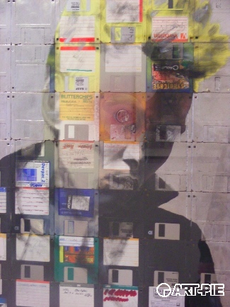
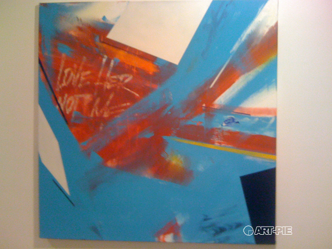
We thank Pam for taking time for this interview and wish all the best for the show. You can see a few pics of some of her compositions for the Beautiful & Damned show which will run until the 29th May 2011